How to use a paper swatchbook
I’ve seen it happen time and again. A designer works on a print project and gets all the way through to the final stages of quoting only to find out the paper they designed the entire piece around doesn’t actually exist. Sounds unlikely but it’s true. I think we often assume that all papers are offered in standard weights, sizes/finishes and we just take for granted our paper specs won’t be an issue. Which is probably the case 80% of the time, but on the 20% they’re not it can really wreck havoc with our deadline, not to mention budget. You can save yourself (and your sanity) a ton of time by doing one simple thing at the onset of a project: open and read the swatchbook.
While every swatchbook is laid out a little differently, the basic information provided is all the same. And this info is crucial to helping designers maximize their budget and meet their deadline. I’m breaking it down into the five attributes to check in the swatch book when it comes properly identifying and specifying paper for your print projects.
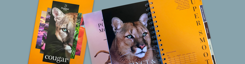
Grade – This is pretty straightforward; the grade is a line of paper made by the paper mill or manufacturer. For example, Cougar® is the grade made by Domtar, the paper mill. Once you’ve identified the grade you’ll easily be able to locate the swatch book in your swatch box– just check the spine for the grade name.
Color – Honestly, the majority of print projects are going to be on a white stock, so if the grade only has one shade of white, move on to the next attribute. But if you are planning to use a colored stock, flip to the color you want in the paper waterfall inside the swatch book. Make sure it’s the shade you’re looking for, you may have to pull a few swatch books and compare shades to help you find that perfect color match.
Finish – Most swatchbooks will be divided and tabbed by finishes. Flip to the finish you are interested in using, in the world of uncoated papers the default finish is going to be smooth, but you’ll most likely see multiple options. For example, the Cougar swatchbook features three finishes to select from: super smooth, smooth and vellum. Flip through each of the tabs and feel the texture of the paper, you’ll notice a very sleek, smooth feel on the super smooth compared to vellum, which has more of a toothy, tactile feel, and smooth is somewhere in between.
How to make the paper swatchbook work for you
Basis Weight – Once you’ve narrowed down the grade, color and finish it’s time to move on to the basis weight. Inside most swatchbooks you’ll find a waterfall of paper. Depending on the grade and number of colors, it may just be a sample of each color in one sample basis weight. NOTE: that does not mean that specific color ONLY comes in the one basis weight–flip to the stock guide. The stock guide is either under the waterfall or adjacent to the waterfall, depending on the layout of the swatch book.
Flipping open the Cougar swatchbook, you’ll find the stock guide underneath the finish tab to the left of the waterfall. Here we see each basis weight that specific color/finish is available in. You’ll want to pay attention here; this is usually where an issue with specs for papers that don’t actually exist happen. For example, Cougar Smooth is available in 100# Text, but 100# Text is not an option in the vellum finish. You definitely want to make sure the grade/color/finish you want is actually made in the basis weight you’re considering, and the stock guide is where you’ll find that info.
* Side note on GSM, when it comes to digital printing you’ll want to pay attention to GSM as well as basis weight. The thickness of paper the digital printing equipment can accommodate is based on GSM (not basis weight), so if you are printing digitally make sure that the basis weight you have in mind is available in a digital paper. This information is all found within the stock guide, and depending on the swatchbook, there may be a spate section specifically for digital items.
Sheet Size – This is going to be more of a concern for the printer than for the creative, however, if you can design with the optimal sheet size in mind, you can benefit when it comes to the budget. When designing a project that’s a non-traditional finish size, if you can do so with the folio sheet size in mind, you will optimize the number of cuts out per sheet and depending on the project, potentially save on waste while maximizing your budget.
For example, a 5.5” square invitation (11” x 5.5” flat) on 130# Cover will yield better results than one that is 6” square (12” x 6” flat). Looking at Cougar 130# Cover, it is available in 35 x 23 (grain direction is always the second dimension, and this matters on heavyweight paper if you want to avoid unsightly cracking). The 5.5” square invitation yields 12 out per full-size sheet whereas the 6” square invitation-only yields 6 our per full-size sheet. Again, this is not something to spend a ton of time worrying about and is more suited for estimators. But, if you’re a designer and really concerned with maxing out your yield, ask your print rep for advice on finished project sizes that minimize paper waste.
FINAL NOTES:
• The swatchbook is also to be a good reference point to see the kind of print results the paper will deliver, as most include print samples on various colors and finishes that will give you a good frame of reference when it comes to print results.
• Still, while a swatchbook is the starting point for your project, I strongly advise your next step being to request sample sheets of the desired papers and maybe even a dummy to get a real feel for the project. If you’re planning using a special print technique, a print sample demonstrating that technique is also a good idea. And don’t be shy about asking for ink draw downs on the paper stock you’re considering if you have any doubt as to the results you want to achieve. By starting with the swatchbook, you’ll eliminate a lot of wasted time and guess work when it comes to your final paper specs.
Retrieved from Domtar